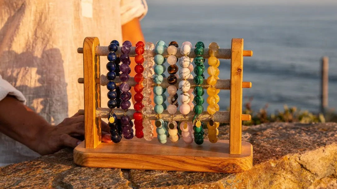
Beautiful beads don't automatically make a beautiful jewelry design. More often, the difference comes down to the gemstone bead color combinations you use. A stunning Mystic Gray Moonstone placed next to the wrong partner can look flat, muddy, or visually disconnected. Pair it with right gemstone bead, though, and the entire design comes together.
Understanding how gemstone colors interact makes jewelry design feel far like guesswork. Whether you prefer soft, tonal palettes or bold contrast, a few reliable principles can help you create combinations that feel intentional, balanced, and wearable.
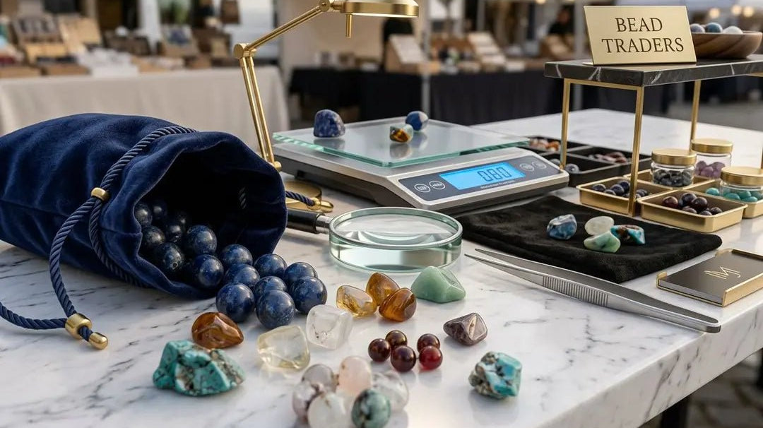
In this guide, we'll discuss 10 gemstone bead color combinations that consistently work well in jewelry design, along with the color theory behind why they succeed. Additionally, we'll explore how when shopping The Bead Traders' Gemstone Bead Collection, you can find a variety of unique options that suit any design style.
A Quick Color Theory Primer for Bead Pairing
Fortunately, you don't need an art degree to understand tonal balancing. Let's cover a few color theory basics:
Hue refers to the basic color family, such as blue, green, purple, or orange. Saturation describes how vivid or muted a color appears. For example, a rich green is highly saturated, whereas a pale sage feels much softer. Value refers to how light or dark a color appears, regardless of hue.
Ultimately, contrast plays a major role in how a design. feels. You can contrast warm and cool tones, light and dark values, matte and metallic finishes, or saturated and muted colors. Each creates a different mood and level of visual intensity.
And finally, neutral materials help balance stronger gemstone combinations, essentially acting as a buffer. Freshwater pearls, metal beads, clear quartz, black onyx, and smoky quartz can all create breathing room between bolder stones.
If you're interested in learning more, the Gemological Institute of America (GIA) offers an exceptional review on colored gemstone value factors. You can also review our client-focused guide, "Color Theory: Choosing the Best Metals for Your Piece," for even more guidance.
10 Gemstone Bead Color Combinations That Always Look Stunning
The following gemstone pairings were chosen for their balance of contrast, harmony, and overall wearability. Use them as starting points, not strict formulas. You can adjust the stones, bead sizes, finishes, and metal accents to better suit your personal style and the type of jewelry you want to create.
1. Emerald + Pearl: Rich Green With Soft Luminosity
Emerald is vivid, cool-toned, and deeply saturated, while pearl feels soft, creamy, and understated. That contrast is exactly what makes the pairing feel so refined. The emerald gemstone beads bring richness and depth, while the pearl softens the palette without muting it.
The combination creates elegance without feeling overly dramatic, making it especially well suited for bridal jewelry, heirloom-inspired necklaces, and elevated everyday pieces. Try using emerald beads as focal accents alongside freshwater pearls for a balanced, timeless look.
Gather some inspiration from our guide, "Fresh Ways To Use Emerald Beads for Jewelry Making."
2. Turquoise + Pyrite: Cool Blue-Green With Metallic Warmth
Turquoise sits between blue and green on the color wheel, while pyrite introduces warm gold-brass tones. That warm-versus-cool contrast gives the pairing its energy and helps both stones feel more vibrant together than they would on their own.
Pyrite’s metallic warmth also balances the brightness of turquoise, keeping the combination dimensional without feeling overpowering. Pair turquoise rounds with pyrite spacers or nugget beads for bracelets, chokers, or layered necklace designs.
Shop real turquoise beads from The Bead Traders for authenticity and transparency. You can also learn more about this unique pairing through our guide, "Turquoise Beads for Jewelry Making: Types, Tips, Ideas."
3. Amethyst + Labradorite: Moody Purple With Iridescent Gray
Amethyst’s violet tones pair naturally with the blue, green, and gold flashes found in labradorite. At its core, this is an analogous color combination, but labradorite’s smoky gray base keeps the saturated purple from feeling overly heavy.
The contrast here is subtle and atmospheric, relying more on shimmer, depth, and tonal variation than dramatic color opposition. Additionally, labradorescence, the metallic play-of-color labradorite is known for, adds movement that makes the pairing feel alive. Use faceted amethyst with smooth or faceted labradorite for earrings, pendants, or celestial-inspired designs.
4. Lapis Lazuli + Carnelian: Deep Blue Against Fiery Orange
Lapis lazuli and carnelian sit on opposite sides of the color wheel, making this a classic complementary pairing. Lapis feels cool, deep, and intense, while carnelian brings warmth, saturation, and energy. Together, they create bold contrast without feeling chaotic.
Complementary color combinations tend to work best when one stone leads and the other acts as an accent. Let lapis dominate the palette, then use carnelian as smaller focal details or spacer accents. Brass, gold-filled, or vermeil findings also help highlight the warmth of carnelian while enhancing the richness of lapis.
5. Rose Quartz + Garnet: Soft Pink With Wine-Red Depth
Rose quartz and garnet both sit within the pink-red color family, making this a naturally cohesive pairing. Rose quartz feels soft, pale, and translucent, while garnet adds deeper wine-red saturation and visual weight. That contrast between light and dark gives the palette dimension without disrupting its harmony.
Using rose quartz as the primary bead with smaller garnet accents keeps the combination balanced and refined rather than overly sweet. This pairing works especially well in delicate bracelets, charm necklaces, and softer, romantic jewelry designs.
Shop our wide range of Rose Quartz Gemstone Beads for tone, value, and, shape variation.
6. Citrine + Smoky Quartz: Golden Brightness With Earthy Shadow
Citrine’s warm yellow-gold tones pair naturally with smoky quartz’s softer brown-gray neutrality. The relationship between them comes down largely to value contrast: bright, glowing color against deeper translucent shadow.
Smoky quartz helps balance citrine’s brightness without dulling it, creating a palette that feels warm, grounded, and easy to wear. Pair the combination with gold chain or gold-toned findings for jewelry that leans autumnal, earthy, or minimalist in style.
At The Bead Traders, you can find both high-quality citrine beads as well as unique smoky quartz beads, making your design process seamless.
7. Aquamarine + Peridot: Fresh Blue-Green With Springlike Yellow-Green
Aquamarine and peridot sit close together on the color wheel, making this an analogous pairing with a naturally harmonious feel. Aquamarine appears soft and watery, while peridot introduces a brighter, more citrus-toned green. That difference in saturation keeps the palette from feeling overly subtle or washed out.
The combination feels light, fresh, and highly wearable, making it especially well suited for delicate necklaces, anklets, and spring or summer-inspired jewelry designs where you want color without overwhelming contrast.
Review our selection of aquamarine beads to begin curating inspiration for your jewelry pieces!
8. Moonstone + Black Onyx: Glow Against Graphic Darknes
This pairing relies more on value contrast than color contrast. Moonstone feels soft, milky, and reflective, while black onyx is bold, dark, and grounding. The dramatic light-versus-dark relationship is what gives the combination its impact.
Moonstone’s signature glow, known as adularescence, feels especially luminous against the solid depth of black onyx. Use moonstone as a focal element with black onyx accents, or alternate the two for a clean, modern monochrome design.
We have plenty of guides available to help you gather inspiration and prioritize product transparency. To start, read "Are Moonstone Beads Real? How to Spot Natural vs Imitation," and "Moonstone Gemstone Beads: Meanings, Types & Design Ideas."
9. Amazonite + Sunstone: Cool Aqua With Peachy Sparkle
Amazonite brings soft blue-green tones, while sunstone adds peachy warmth and natural shimmer. The pairing creates warm-versus-cool contrast, but because neither stone is overly intense, the overall palette still feels balanced and approachable rather than overly bold.
Rose gold, copper, and gold-toned metal accents all complement the warmth in sunstone while enhancing the relaxed, sunlit feel of amazonite. The result works especially well in beach-inspired, seasonal, or softly colorful jewelry designs.
Review our amazonite bead selection to begin gathering inspiration.
10. Malachite + Tiger's Eye: Earthy Green With Golden Brown Movement
Malachite’s vivid banded green pairs naturally with the warm golden-brown tones of tiger’s eye, creating a palette that feels earthy, rich, and grounded. The contrast comes from cool green against warm brown, while both stones contribute natural movement and pattern.
That visual texture is what makes the combination so compelling, but it can also make a design feel overly busy if overworked. Keep surrounding elements simple with plain metal spacers, minimal findings, or sections of chain to give the eye space between the stones.
This is by far one of the most unique combinations, and you can learn more in our post, "Looking into the Cat’s Eye - A Guide to Understanding Tiger Eye Beads."
How to Adjust These Pairings for Your Own Jewelry Style
Remember, these combinations are a starting point, not a standard guideline. Here are a few ways you can make these pairings your own:
Remember, these combinations are a starting point, not a standard guideline. Here are a few ways you can make these pairings your own:
- Change the ratio. An 80/20 split, where one stone dominates and the other acts as an accent, tends to feel more refined. A 50/50 split creates stronger contrast and a bolder overall look.
- Change the bead size. Smaller accent beads add subtle color variation, while larger focal beads create more visual impact. Mixing bead sizes also helps add rhythm and movement within a design.
- Think about metal choice. Gold warms a palette, silver cools it, brass adds vintage depth, and gunmetal creates a more dramatic feel. Metal accents influence the mood of a design just as much as the gemstones themselves.
- Use bridge materials thoughtfully. Freshwater pearls, metal spacer beads, and chain can help connect contrasting gemstones and make a palette feel more cohesive. Seasonal stones, unusual cuts, or new gemstone arrivals can also refresh familiar color combinations in unexpected ways.
Simple Design Tips for Making Color Pairings Look Intentional
A few small design choices can make gemstone color combinations feel much more cohesive and polished:
- Repeat each color throughout the design: A single isolated accent bead can look accidental rather than intentional.
- Use spacer beads strategically: Spacer beads help create breathing room between stronger or more saturated colors.
- Balance surface finishes: Pair opaque stones with translucent, faceted, pearly, or metallic elements to add variation and depth.
- Keep the silhouette simpler when the palette is bold: Strong color contrast already creates visual interest, so overly complex shapes can make the design feel busy.
- Use neutral chain or findings to unify multicolor palettes: Metal accents and neutral materials can help tie contrasting gemstones together without introducing another competing color.
Looking for even more inspiration? Check out some of our posts, including "Beading 101: How to Get Started Making Jewelry" and "Crafting with Gemstone Beads: Step-by-Step DIY Jewelry Guide."
When you start with color, you can let the stones lead your design.
Stunning jewelry starts with understanding how hue, saturation, value, and contrast interact. Once you have that foundation, choosing stones becomes much more deliberate and much less guesswork.
Pick one stone you love. Then choose a partner based on harmony, where the colors share something in common, or contrast, where they push against each other in an interesting way. Either approach can produce great gemstone bead color combinations. The key is knowing which one you're going for.
The Bead Traders carries gemstone beads, freshwater pearls, metal beads and findings, and chain by the foot to help you build any of the palettes above. U.S. orders over $100 qualify for free shipping and returns, so it's easy to order a range of stones and experiment before you commit to a final design.