SILVER
 When in doubt, silver is almost always a good choice. It pairs well with every color and even other metals. It conveys a classic sophistication that never goes out of style. Some of the best gemstone pairings for silver are turquoise, lapis lazuli, and celestial quartz. Silver pairs well with pastel colors (think Tiffany & Co.’s blue and silver box), but it also complements and enhances bold colors. It is considered a neutral color and feels very sophisticated when accompanied by other neutral colors.
GOLD

Gold works well with warm earth tones and cool pastel colors. It is a natural choice for nature-inspired color schemes. Purple stones like purple opal, amethyst, or agate are exquisite when paired with gold. Gold also makes a beautiful partner for all shades of reds, rusty oranges, and reddish yellows.
When pairing with neutrals, warm deep-toned neutrals work best. These include your slate grays, chocolate browns, olive greens, and dark tans. When choosing white, go for a warmer shade so that the contrast isn’t too stark.

One note of caution: Because gold comes in many different shades, some yellow gemstones might clash with the wrong gold color. It is a good idea to have several varieties of gold chains in your collection that can make perfect matches with the best shades of your yellow stones.
BLACK GOLD/PEWTER
Black looks fabulous with primary colors but can go with any color. Combined with white and black, or silver and black, black gold conveys sophistication and elegance. For a more casual look, use black gold as a backdrop for bright colors like yellow, magenta, hot pink, or turquoise. It also pairs well with neutrals like white, beige, and brown. Finally, purple and black gold are gorgeous together.

ROSE GOLD
Rose Gold has a warm pink undertone similar to copper and is a natural fit for shades of pink like blush, dusty rose, and burgundy. With a powder blue, grey-toned lavender, or mint green - rose gold can bring a sense of serenity. (Perhaps one reason for the popularity of this combination in today’s home designs). To bring out the metal's rosy tones, even more, pair it with rich, saturated colors such as black, teal, or navy. Among these dark colors, rose gold will be warm and radiant.


THE MOOD OF THE PIECE
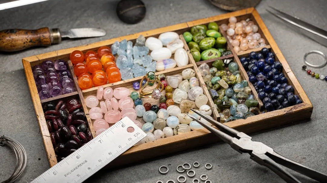
Generally speaking, cool tones convey peace and serenity - warmer colors give a sense of passion and energy. Before you commit to a metal, lay your gemstones out next to the chain. Try various metals to see what appeals to you. You might even create the same pieces using different metals and have two or three entirely new creations. Color is the language of the soul, and various colors will speak to people in unique ways.
CHANGE YOUR PERSPECTIVE
Colors and color combinations will look different in different lights. You probably have an area where you do most of your work and that has good lighting. Sometimes it helps to take your piece to a new location and light source. Doing this might inspire you to change a bead or two or go with a color scheme you hadn’t previously considered.
As you see your colors in different lights - take a step back and observe the colors and textures from a distance. See what catches your eye, and get a feel for how the colors and materials flow together. Changing your perspective will give you confidence that you are on the right track and help you connect with your vision for each item.
Also, consider the background you have underneath the piece. A neutral or white cloth will give you the cleanest version of your colors.
CONCLUSION
Silver tones have a soothing, relaxing effect, and gold is warmer and more exciting.
But in today’s design world, the main rule is there are no rules! What ultimately matters is what you or your customer likes. Go with what you love. Some seasons, it may be silver; other times gold, black, or copper. It comes down to what is pleasing to you at that moment. The beauty of jewelry design is you can play around with various combinations and looks. By comparing metals and exploring how they interplay with your stones, you’ll discover fresh and beautiful designs that will color your world!